Kudos
Brand Identity
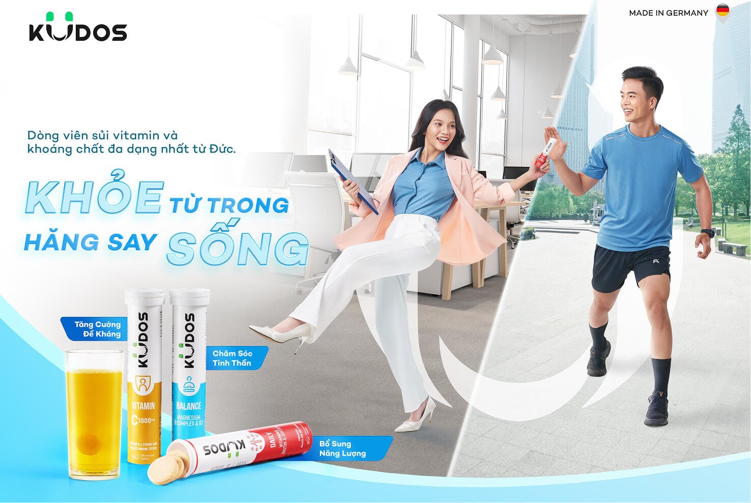
Kudos needed a distinctive identity that truly reflected its brand spirit. RIO Creative Solutions developed the concept **“The Happy Hormones”**—inspired by the four happiness hormones, each represented through a unique color. This created a signature visual identity while spreading the message of positive living from a scientific perspective.
Through in-depth research on Kudos, RIO Creative Solutions developed a new brand identity system with a fresh and distinctive approach compared to its competitors. This not only reinforces the brand spirit but also affirms Kudos’ commitment to delivering a better brand experience for its customers.
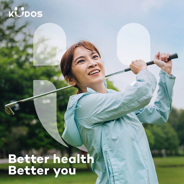
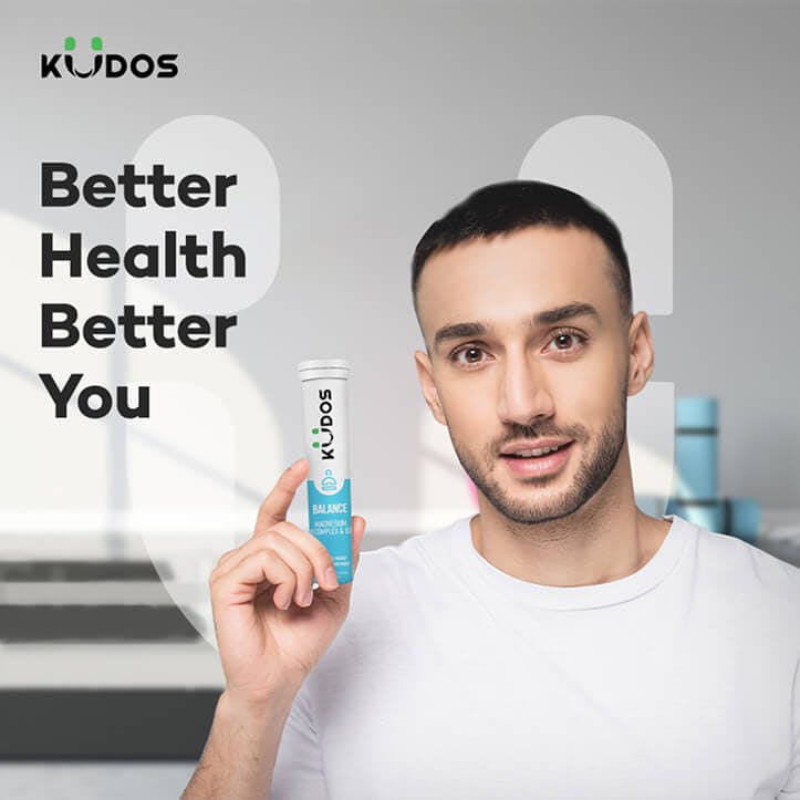
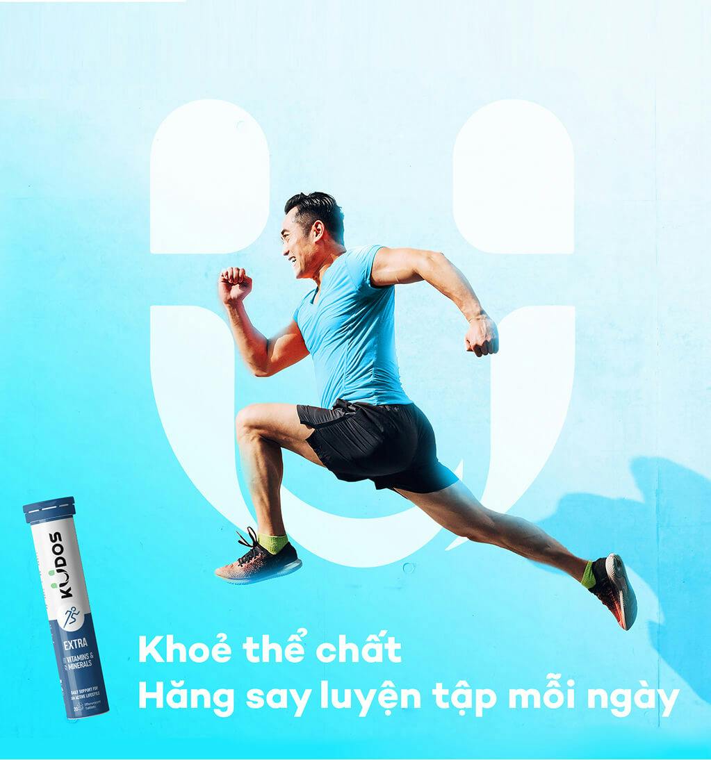
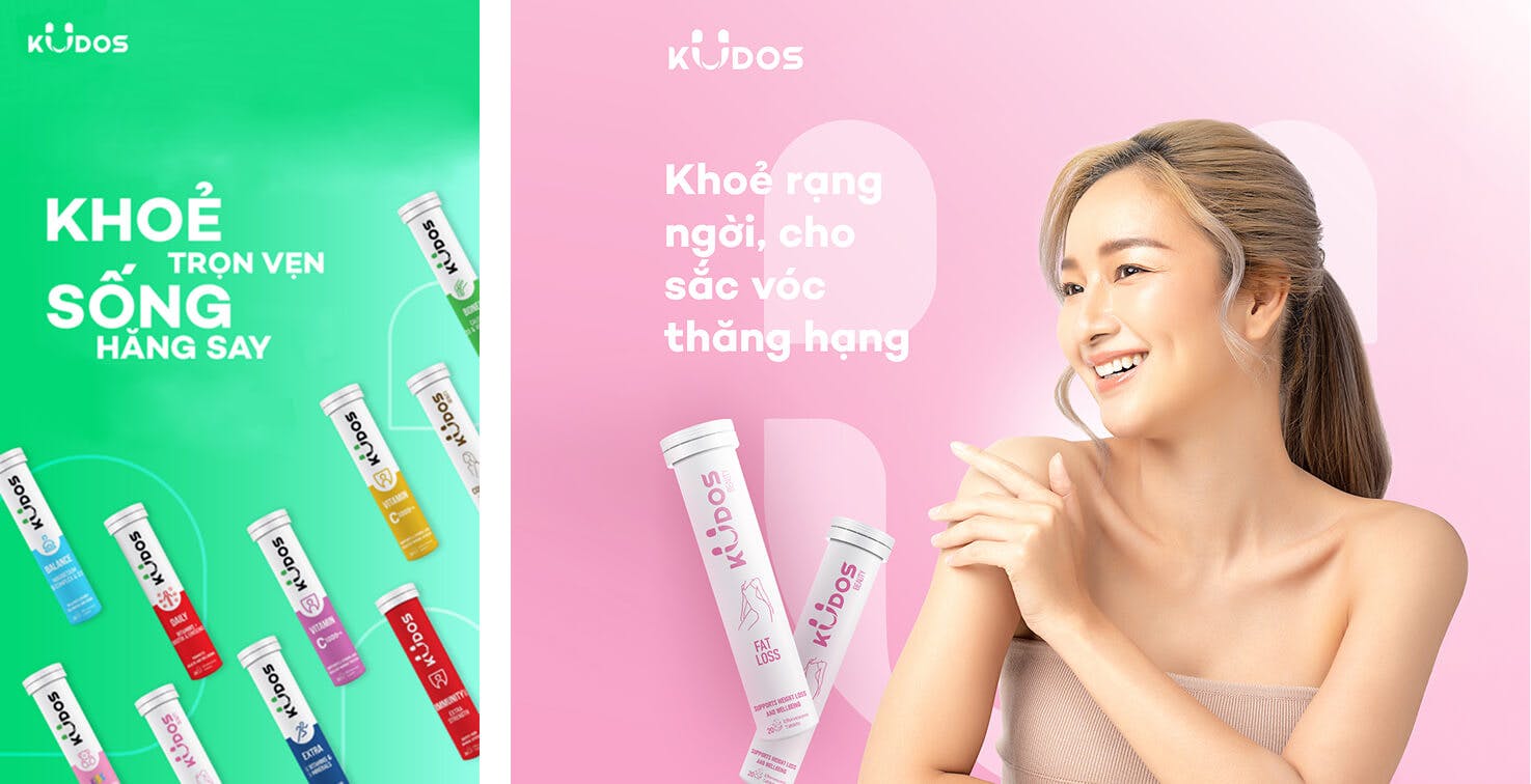
The new visual identity embodies boldness and uniqueness while radiating vitality, approachability, trust, and hope. At the same time, it conveys the spirit of well-being—promoting a positive lifestyle filled with energy that flows from the inside out.
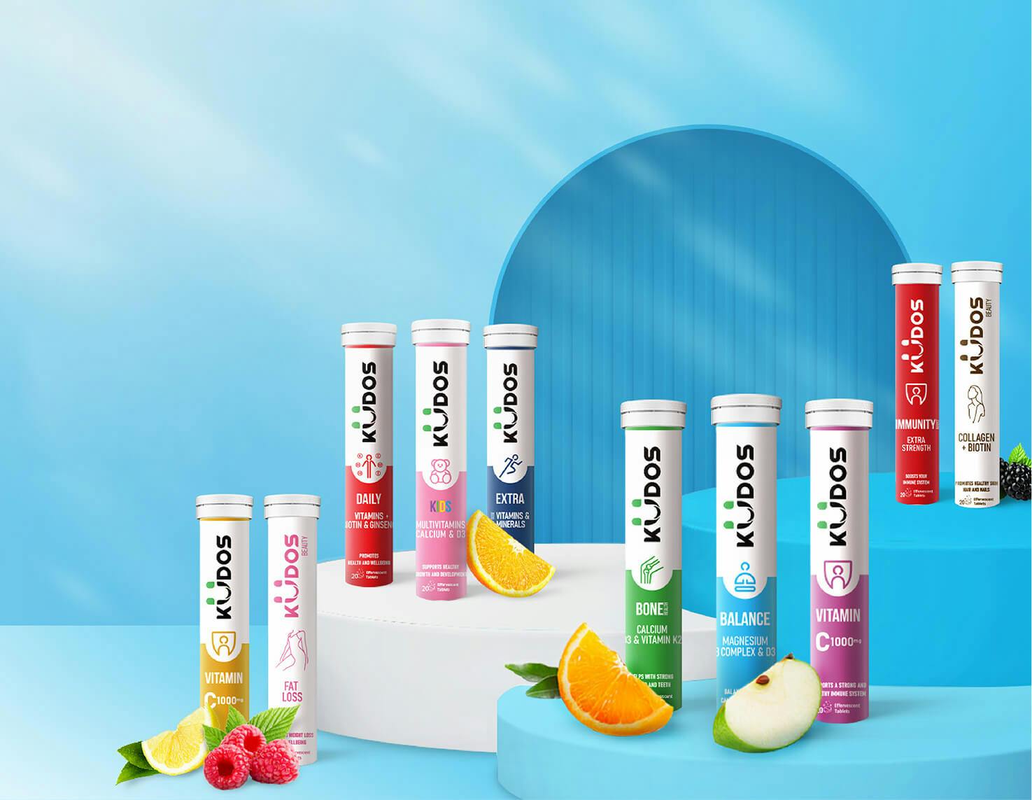
The new brand identity system goes beyond aesthetics—it is designed to create a consistent and memorable visual experience across every brand touchpoint. From the logo and color palette to the iconography and visual style, every element has been carefully crafted to convey positivity, trust, and aspiration—true to the spirit Kudos seeks to inspire and share.